Introduction:
in the fast-paced world of YouTube, first impressions matter—and your thumbnail is the ultimate handshake.A well-crafted thumbnail doesn’t just grab attention; it tells a story, sparks curiosity, and compels viewers to click. Whether you’re a seasoned creator or just starting out, mastering the art of thumbnail design can be the difference between blending in and standing out. From bold visuals to strategic text placement, let’s explore the secrets behind crafting thumbnails that stop the scroll and drive engagement. Ready to turn your thumbnails into click magnets? Let’s dive in.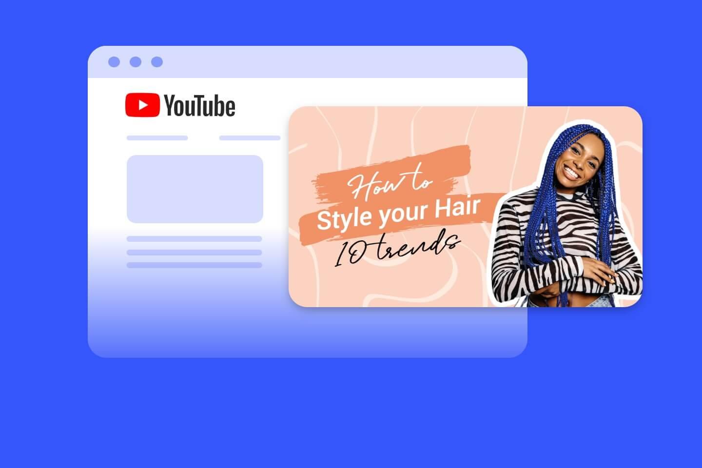
Understanding the Psychology Behind Click-Worthy Thumbnails
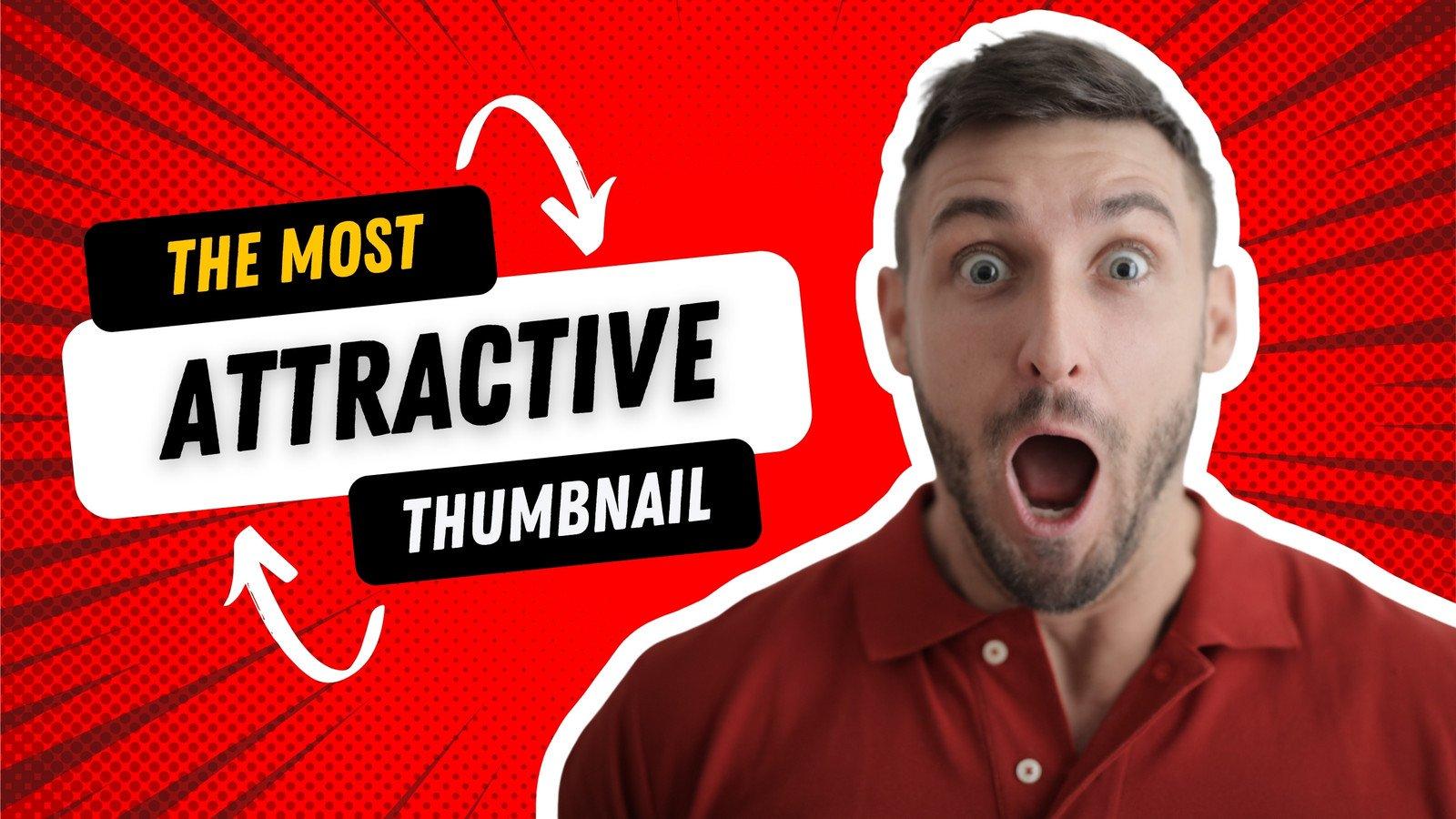
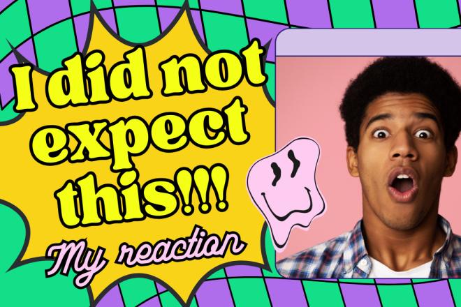
Creating attention-grabbing thumbnails isn’t just about aesthetics—it’s about tapping into human psychology. Our brains are wired to respond to visual cues, and certain elements can trigger curiosity or excitement. As an example, contrasting colors stand out against the noise of a crowded feed, while facial expressions evoke emotional connections.A thumbnail that hints at a story or a solution to a problem can instantly pique interest. Think of it as the first impression that decides whether someone clicks or scrolls past.
Here’s a breakdown of what makes a thumbnail irresistible:
- Clarity: A clear focal point ensures the message is instantly understood.
- Curiosity Gap: Tease the content without giving everything away.
- Emotional Appeal: Use expressions or imagery that resonate with your audience.
| Element | Psychological Impact |
|---|---|
| Bright Colors | Draws attention and creates urgency |
| Faces | Builds relatability and trust |
| Text Overlays | Communicates value quickly |
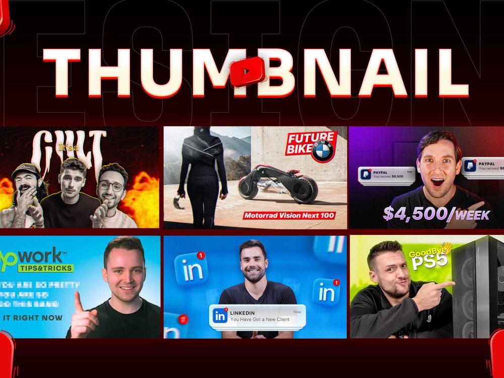
Design principles for Visually Striking Thumbnail creations
Creating thumbnails that grab attention requires a mix of artistic flair and strategic thinking. A well-designed thumbnail not only entices clicks but also sets the tone for your video’s content.Here are key elements to consider:
- Contrast & Vibrancy: Bold colors and high contrast make your thumbnail pop in search results.
- Minimal Text: A few impactful words work better than cluttered descriptions.
- Expressive Imagery: faces with strong emotions or dynamic compositions draw the eye.
- consistency: A recognizable style helps build your brand identity.
| element | Best Practice |
|---|---|
| Font Choice | Use bold, readable fonts with high legibility. |
| Composition | Follow the rule of thirds for balanced visuals. |
| Negative Space | Avoid overcrowding—let key elements breathe. |
Beyond aesthetics, thumbnails should align with your video’s message while sparking curiosity. Test different designs to see what resonates with your audience, and refine your approach based on performance metrics. Remember, a great thumbnail is a promise—it should deliver on the intrigue it creates.
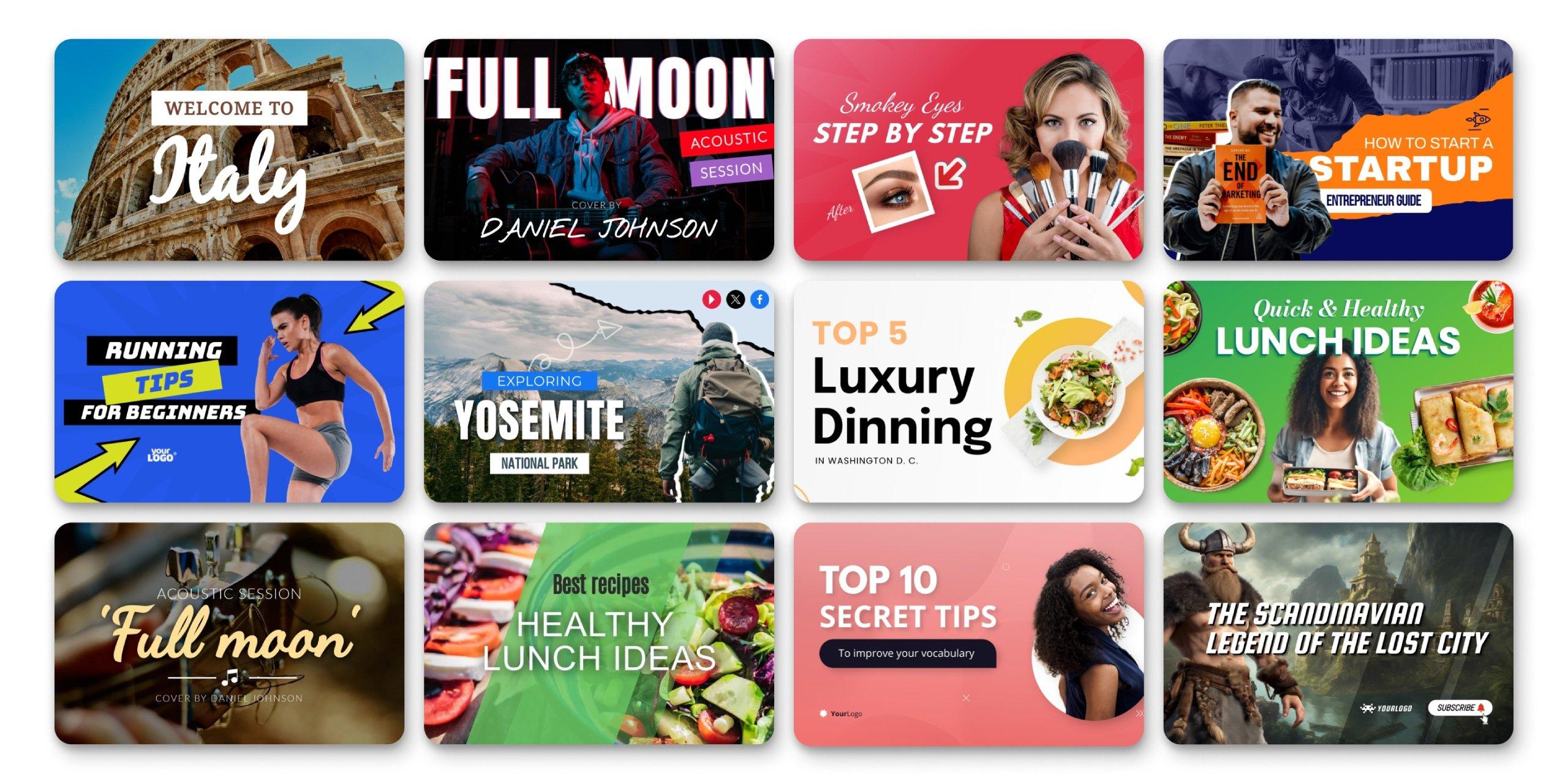
Choosing the Right Colors, Fonts, and Imagery for Maximum Impact
Creating a visually striking YouTube thumbnail starts with a harmonious blend of colors, fonts, and imagery. A well-chosen color palette can evoke emotions and grab attention instantly. For example, using complementary colors like blue and orange ensures your thumbnail stands out, while contrasting shades emphasize key elements. When selecting fonts, prioritize readability and boldness. Sans-serif fonts like Roboto or Montserrat are clean and modern, making your text easy to read even at smaller sizes. pair this with imagery that tells a story—whether it’s a close-up of a face, a dramatic scene, or a striking object, the visual should instantly convey the video’s essence.
To optimize your design further, consider the following swift tips:
- Consistency is key: Use a consistent style across your thumbnails to build brand recognition.
- Less is more: Avoid clutter by focusing on one or two main elements that capture attention.
- Test and refine: Experiment with different color schemes and layouts to see what resonates with your audience.
| Element | Best Practices |
|---|---|
| Colors | Use 2-3 complementary or contrasting shades |
| Fonts | Choose bold, readable sans-serif fonts |
| Imagery | Focus on high-contrast, storytelling visuals |
Optimizing Thumbnails for Different Devices and Viewer preferences
Creating thumbnails that look stunning across all devices requires a mix of technical precision and creative flair. mobile users scroll quickly, so bold text and high-contrast colors grab attention, while desktop viewers may appreciate finer details. Here’s how to adapt:
- Prioritize readability—ensure text is large enough for small screens but not overwhelming on bigger displays.
- Test on multiple devices—preview how your thumbnail appears on phones, tablets, and desktops.
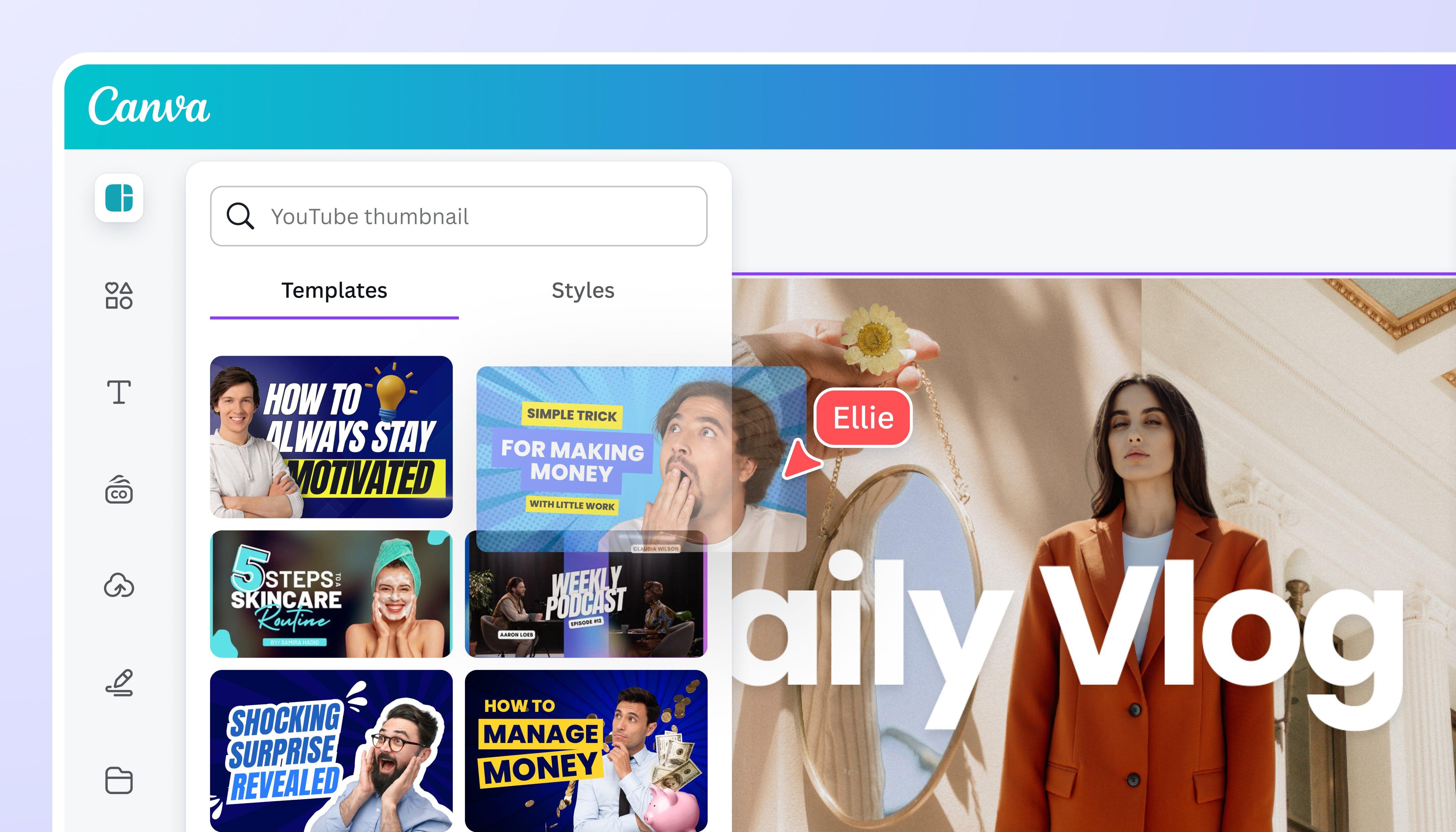
- Use responsive design tools—platforms like Canva or Photoshop let you adjust layouts for different dimensions.
| Device | Key Consideration |
|---|---|
| Mobile | Simplified visuals, larger text |
| Desktop | Detailed imagery, balanced composition |
Viewer preferences also play a role—some audiences respond to faces, while others engage with text-heavy designs. A/B testing helps identify what resonates. For gaming channels, vibrant action shots work best, whereas tutorial creators might opt for clean, instructional visuals. Always align thumbnails with your brand’s style while staying flexible enough to cater to platform algorithms and trends.
In Retrospect
Outro:
Crafting eye-catching YouTube thumbnails is more than just a skill—it’s an art form that bridges creativity and strategy. By understanding your audience, leveraging design principles, and staying consistent, you can transform your thumbnails into powerful tools that captivate viewers and drive engagement. Remember, the best thumbnails don’t just grab attention—they tell a story, spark curiosity, and invite clicks. So, experiment, refine, and let your creativity shine. Your next thumbnail could be the gateway to your video’s success. Happy designing! 🎨✨