Unlocking the Power of Visual Appeal: Crafting Eye-Catching YouTube Thumbnails
In the bustling world of YouTube, where millions of videos compete for attention, the first impression can make all the difference. Imagine a virtual shelf lined with colorful, intriguing book covers—each one beckoning you to take a closer look. That’s precisely what a YouTube thumbnail does: it’s the digital handshake, the enticing invitation that draws viewers into your content. But crafting a thumbnail that stands out amidst the noise is both an art and a science. It’s about striking the perfect balance between creativity, clarity, and strategy. Whether you’re a seasoned creator or just starting out, mastering the art of designing eye-catching thumbnails can elevate your channel’s visibility and engagement. In this guide, we’ll explore simple yet impactful techniques to transform your thumbnails from overlooked to irresistible, helping your content shine in the vast sea of YouTube.
The Art of Visual Storytelling in YouTube Thumbnails
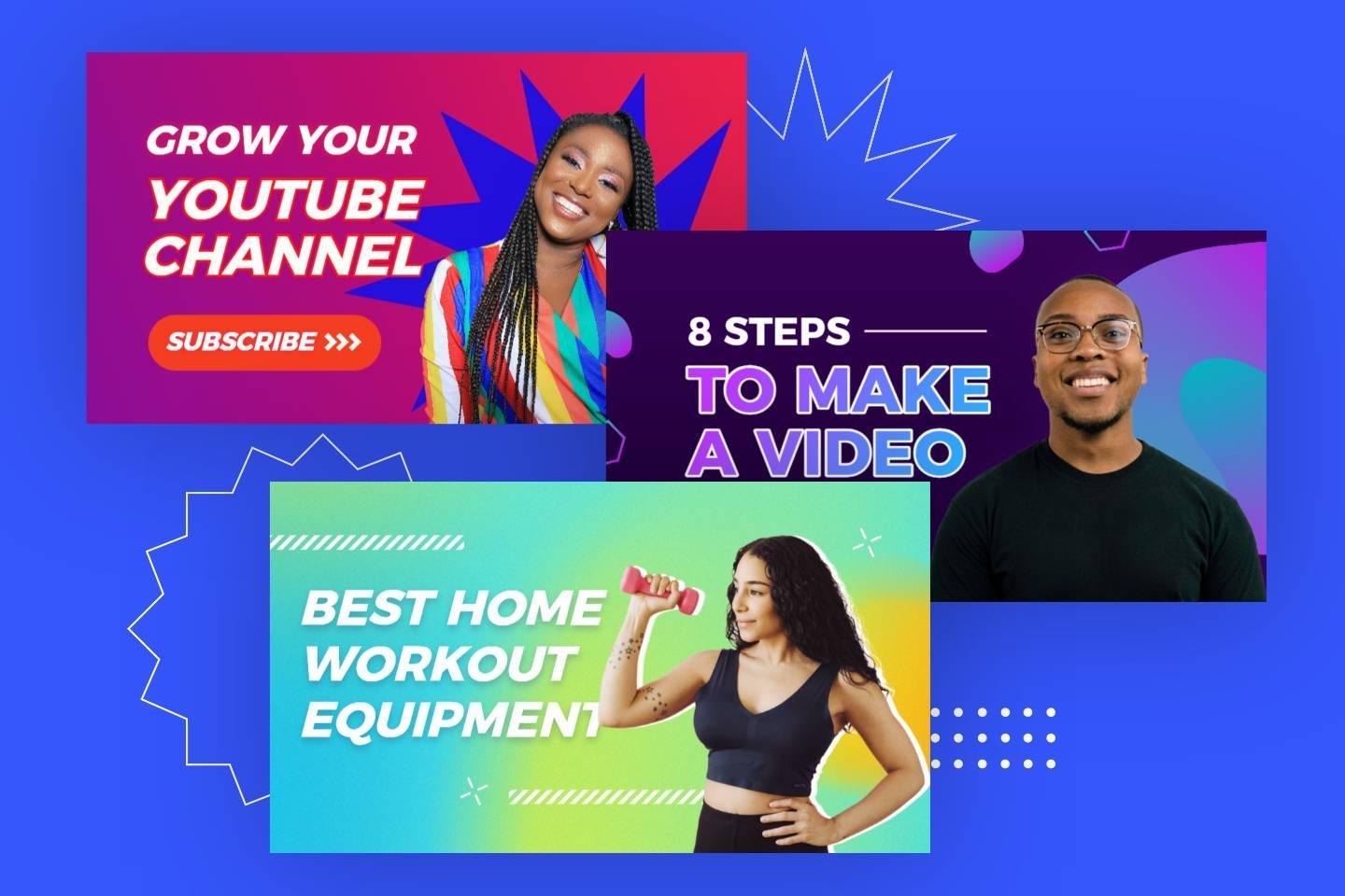
Creating visually appealing thumbnails is more than just an art—it’s a science that combines design principles with audience psychology. Your thumbnail is the first impression viewers have of your video, and it needs to stand out amidst a sea of competing content. Start by focusing on contrast—use vibrant colors that pop against a neutral background. Ensure your text is concise and legible, ideally limited to a few words that convey the essence of your video.
- Incorporate human faces with expressive emotions to build a connection.
- Use high-quality images that are sharp and clear.
- Keep your branding consistent with recognizable fonts or colors.
By following these guidelines, you’ll craft thumbnails that not only catch the eye but also drive clicks.
Another key element is understanding your audience’s preferences and tailoring your design accordingly. For instance, if your content targets younger viewers, bold and playful visuals might work better. for a professional audience,clean and minimalistic designs could be more effective. Here’s a simple breakdown of design elements based on audience type:
| Audience Type | Design Style |
|---|---|
| Teens/young Adults | Bold colors, trendy fonts, dynamic visuals |
| Professionals | Neutral tones, clean layouts, minimal text |
| Gamers | Action shots, vibrant effects, dramatic fonts |
Remember, the goal is to communicate your video’s value in a single glance. Experiment with different designs, analyze performance metrics, and refine your approach to create thumbnails that consistently attract attention.
Essential Design Elements for High-Click Thumbnails
Creating thumbnails that grab attention requires more than just a random image and text overlay. Start with contrast and brightness to make your visuals pop—darker backgrounds with vibrant elements draw the eye instantly. Pair this with bold typography that’s easy to read even on smaller screens. Avoid clutter by focusing on a single focal point, like a person’s expressive face or a key object related to your video. Consistency in your design style also helps build recognition, so stick to a signature color palette or font family.
Another critical factor is emotional resonance. Use facial expressions or imagery that evoke curiosity, excitement, or urgency. Complement this with high-quality visuals—blurry or pixelated images can deter viewers instantly.For added clarity, highlight the video’s value proposition in a concise tagline or icon. Below is a swift reference table for essential elements:
| Element | Purpose |
|---|---|
| Contrast | Ensures visibility |
| Typography | Communicates message |
| Focal Point | Draws attention |
| Emotion | Engages viewers |
Choosing the Right Colors and Fonts to Stand out
Selecting the perfect combination of colors and fonts can make or break your YouTube thumbnail design. Contrasting hues like teal paired with orange or yellow with navy blue can instantly grab attention, while bold fonts such as Impact or Bebas Neue ensure readability even on smaller screens. Here’s a quick checklist to guide your choices:
- Use complementary colors to create visual harmony.
- Avoid overly intricate fonts that may become illegible.
- Limit your palette to 2-3 colors to maintain simplicity.
- Ensure text stands out by adding a stroke or drop shadow.
To further refine your design, consider the psychology behind colors. Warm tones like red or yellow evoke excitement,while cool tones like blue or green convey calmness. Pairing these with the right fonts can amplify your message. As an example, a sleek sans-serif font paired with vibrant colors works well for tech or gaming niches, while softer serif fonts with pastel shades suit lifestyle or beauty content.
| Color | Emotion | Best Font Pairing |
|---|---|---|
| Red | Urgency/Passion | Montserrat |
| Blue | Trust/Calm | Roboto |
| Yellow | Optimism/Energy | Bebas Neue |
Practical Tips for Testing and Optimizing Thumbnail Performance
To ensure your YouTube thumbnails capture attention and drive clicks, testing and optimization are essential. start by leveraging A/B testing tools to compare different thumbnail designs. Focus on variations like colors, contrast, and composition to determine what resonates moast with your audience. Analytics platforms such as YouTube Studio can provide valuable insights into click-through rates (CTR), helping you identify winning designs. Additionally, consider these quick tips:
- Use bold text that’s easy to read even on small screens.
- Incorporate faces or emotions to create a human connection.
- Maintain brand consistency with colors and fonts.
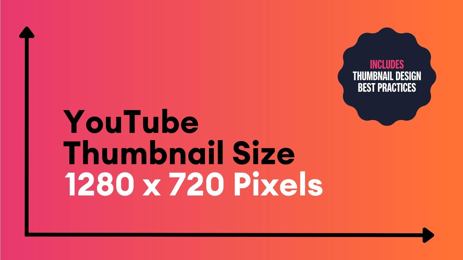
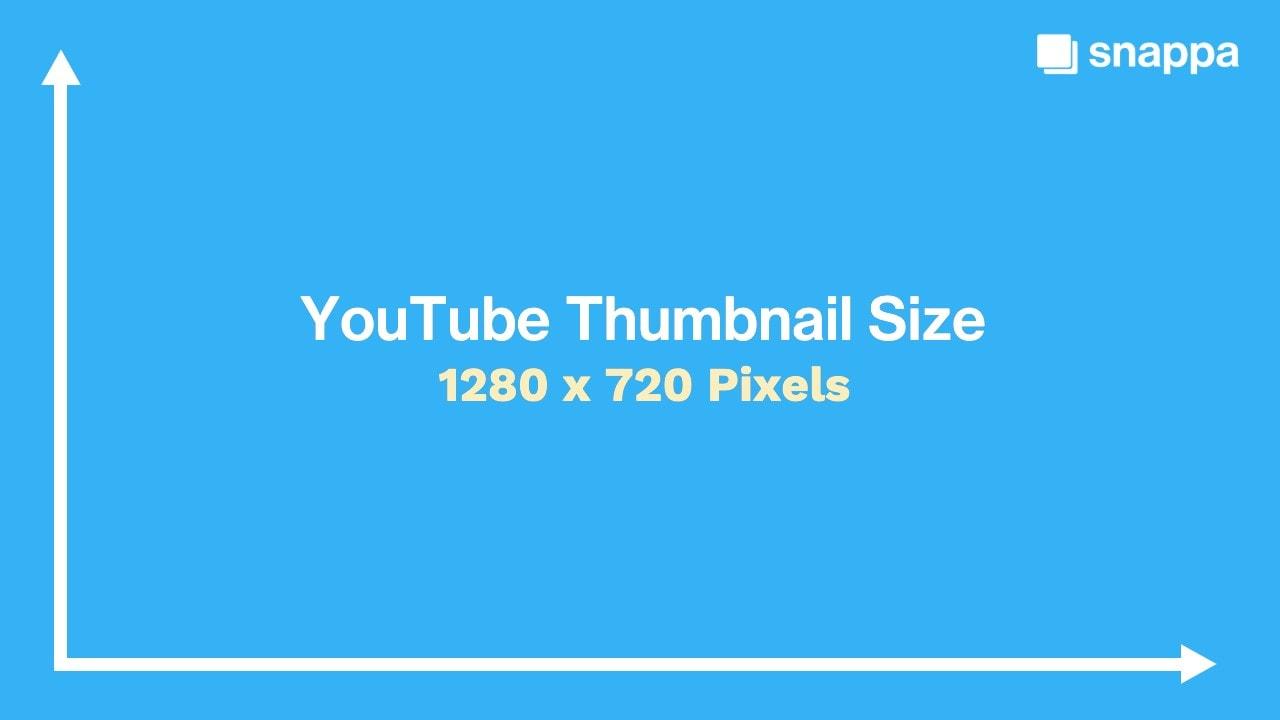
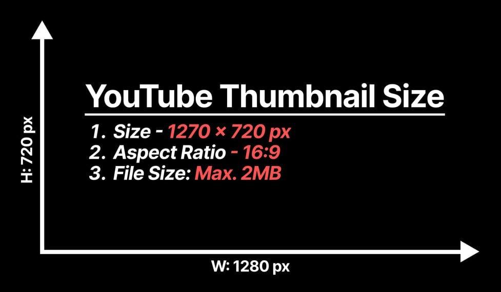
Beyond aesthetics, technical optimization is equally crucial. Ensure your thumbnails are high-resolution (1280×720 pixels is ideal) to avoid pixelation. Compress images without sacrificing quality to improve loading speed. Experiment with placement of key elements to guide the viewer’s eye effectively. Here’s a quick reference table for thumbnail optimization:
| Element | Best Practice |
|---|---|
| Resolution | 1280×720 pixels |
| file Size | Under 2MB |
| Text Length | 3-5 words |
Final Thoughts
Outro:
As you venture into the world of YouTube content creation, remember that a thumbnail is more than just a tiny image—it’s your first handshake with your audience, a silent storyteller that invites them to click, watch, and stay. Crafting eye-catching thumbnails doesn’t require fancy tools or endless hours; it’s about clarity, creativity, and connection. Keep experimenting,refining,and aligning your designs with your unique brand voice. With every thumbnail you create, you’re not just designing a visual—you’re building a gateway to your content. So,go ahead,let your creativity flow,and watch as those clicks turn into views,viewers into subscribers,and your channel into a space that truly stands out.Happy designing! 🎨✨